

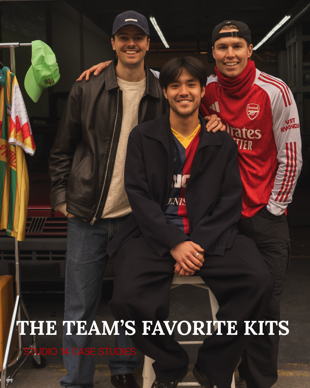
CASE 024: THE TEAM’S FAVORITE KITS
CASE 023: PERSPECTIVES ON MLS CUP 2025, BY JOHN BANEY
CASE 024: THE TEAM’S FAVORITE KITS
PART 1: MAX NEVE
Hi there!
For those who don’t know me, my name is Max Neve, and I, like many others, love soccer jerseys. In the spirit of our organization’s commitment to curiosity and a relentless pursuit of “always making it fun,” I assigned everyone on the team a piece of homework. I asked that they go home, look through their drawers, their closet, through that bag under their bed, and tell me what their favorite football kit is and why.
Why this assignment? For one, everyone who works at Studio 14 Case Studies loves football shirts. And two - It is my belief that reading someone’s words or listening to them speak about something they love is the best way to understand who they are. Consider this an intro to those working tirelessly to get you to crawl out of your bed and kick a ball around, or grab a coffee and watch soccer during this devastatingly cold winter.
As the one who assigned the homework, it’s now my responsibility to tell you which kit is my beloved favorite. In evaluating the question, I immediately landed on a few criteria that would help me in choosing between the many I love.
1. Function and Form: Perhaps it's my background in the technical apparel world. Or maybe it’s my older brother, a perpetual product nerd and career product developer, whispering in my ear, drilling home the difference between a knit and a weave. Regardless of its origin, a football shirt, soccer jersey, kit, whatever you want to call it, is a performance garment first and foremost. That is the context in which it was created. Its purpose? To uniform athletes for competition. To me, if you are a performance garment, you better damn perform.
2. Affinity: As an infatuated lover of football shirts, if I didn’t set rules for myself, my paycheck would go out the door every month, and my drawers would be filled with kits sitting in the shadows. That’s just a waste to me. That’s ultimately why I imposed the rule of affinity. Am I a fan of the team? Did I go see one of their matches? Did I visit the city or town they represent? Do I have a social connection to the club or nation? If the answer is NO to all of the above, then no matter how aesthetically pleasing the kit may be, it does not belong with me.
3. Design: To me, this is where function, form, and affinity are married in a way that determines whether the kit will be a commercial success or find its way to the end-of-season sale en masse. In my evaluation, successful design pays homage to the codes of the house. It recognizes the through-lines of color and pattern that make a team’s kit from 1971 a member of the same family as their kit from 2021. Design done well ties generations together while embracing the current day with innovative Pantone colors, interpretation of hard and soft lines, and a reinvention of how something that has lasted for decades (whether it be directly from the team itself or the place in which they hail from) can come again, fresh and exciting for the new season ahead.
4. Sentimentality: A kit received as a gift will always carry more weight than a kit purchased for oneself. When I was eight years old, my family from the Netherlands brought me the 2008 Ajax shirt from the new season ahead. I loved it. It was the kiss of home across the Atlantic that made me feel closer to them. I wore it every day for years, only stopping when I rolled in Deer s**t and my Grandmother drew the line that it must be washed several times.
So finally, after dancing around my rationals, what is my favorite kit in the closet? Recency bias may be playing a role here, but my Player-Issue 2025/26 Arsenal Home Long Sleeve Kit is my current answer.
1. Form and Function: The kit manufacturer, Adidas, uses their HEAT RDY technology on player-issue shirts (the ones the pros actually wear in the games). The technology has Aqua-X yarns - innovative fibers designed to absorb and move sweat away from the skin more efficiently, resulting in an incredibly lightweight feel and garment silhouette that falls over the body gracefully.
2. Affinity: I’m an Arsenal fan - simple as that. It doesn’t all have to be so damn complicated all the time. But if I must add a note - I teared up listening to North London Forever at the Emirates this past month, seeing a match in North London for the first time since 2013. I love my club.
3. Design: A lovely red Pantone with patterned A’s from a previous Arsenal logo in the 1980s subtly blanketed across the trunk of the garment, standard white sleeves, and three red lines striped down the arms - the kit is a lovely balance of old and new. Sleek and simple.
4. Sentimentality: I did not treat myself to this shirt - my wife did. Not a soccer fan by nature, but a fan of me (hopefully) - she stops at nothing to support my innocuous love of this sport, ultimately because she loves seeing me happy. To wear the shirt of my favorite team and think about the person most important to me in this world is a combination that could only yield one outcome - my favorite football shirt.
At this point, you may be coming to the belief that “this dude thinks way too much about football shirts.” And you may be totally correct. But I think if anything, I’ve put forth a decent argument for my belief “that reading someone’s words or listening to them speak about something they love is the best way to understand who they are.”
That leads me to my final thought. We’d love to know more about you? So if you’d like to write something about what you love, we’d relish the chance to get to know you better. Shoot us an email at studio14casestudies@gmail.com.
With all the love in the world,
Max
PART 2: JOHN BANEY
Unlike our founder and fearless leader, Max Neve, my kit purchasing behavior lacks formula. There’s not a ton of rhyme or reason in my approach. If it’s made it up onto the great wall of kits in the narrow foyer of my studio apartment, where all my finest treasures are bestowed, it’s probably just because it’s an NYCFC kit, a Manchester United kit, or a moderately cool-looking vintage model I snagged from a Saturday’s Football pop-up after being drawn in by its intense gravitational pull.
The one commonality that is often shared, however, is the names on the back. Chances are, if your surname is proudly displayed on my wall of kit fame, something terrible has happened in your career.
I’m not sure how I ended up with such an oddball collection. Maybe it’s my tendency to avoid a club’s most famous player for fear of being labeled as too basic by the very footballing hipsters I’m wearing the kit to impress. Perhaps it was just wishful thinking in the first place on a new signing that I was sure was going to hit the ground running. Or, maybe I’m too easily wooed by things that don’t actually matter on the pitch, like a player’s general aesthetics, dance moves, or cool hair. Maybe I just don’t know ball.
Whatever the reason, I’m often sat here in 2025 wondering exactly how I managed to pick that player to have screen-printed across the back of my beautiful shirts by those ghouls at Fanatics.
Most of these examples come in the form of ultimately goofy Manchester United selections like
Jesse Lingard (went on loan twice before being shipped off to Korea), Casimero (I’m dying for him to go to Saudi), Marcus Rashford (broke my heart), and Zlatan Ibrahimovic (changed his number and immediately tore his ACL).
But the shirt that incapacitates my kiss of death the best is my 2019/2020 FC Barcelona home jersey, purchased at the Camp Nou during a preseason clash with Arsenal, bearing not the name of Lionel Messi, but instead, Antoine Griezmann.
Griezmann had just signed for Barca for a whopping $120m, ending a years-long courtship between the Frenchman and the Catalonian side. He was joining Messi, Luis Suárez, Ousmane Dembélé, and Ansu Fati in what I thought would be the most fun attacking setup in Europe that season.
In a few months' time, a 21-year-old version of myself was even set to move to Spain for six months to study Spanish in the beautiful Andalucian city of Málaga. While I grew out my flowing curly locks to the exact cut of Antoines, I could already picture myself joyfully battling my verb conjugations through the sweet taste of a €2 Cruzcampos, with my beautiful new Griezmann kit flowing in the sea breeze. Everything was going to be perfect.
Messi, the man whose jersey I had every opportunity to buy that day, didn’t feature in this preseason clash, but he did hop on the mic to let everyone know that this would be Barca’s year.
It was not, in fact, Barca’s year. They sacked Ernesto Valverde midseason, faced early exits in the Copa Del Rey and the Supercopa, finished 2nd in La Liga, and we’re bounced from the Champions League by Bayern Munich in the form of a now-famous 8-2 ass-kicking. It marked their first season without a trophy in over a decade.
Things weren’t any better for Greizmann on the individual level. He managed 9 goals and 4 assists in La Liga that season, which is better than I remember him doing but worse than we all expected from him.
The general consensus among fans was that the forward was struggling to settle into the club’s non-negotiable 4-3-3, where there was no perfect home for Antoine - he’d grown comfortable playing in a second striker role at Atletico Madrid that simply didn’t exist at Barca. Cast out on the left wing, Griezmann’s awkward fit and lack of confidence were aired out publicly by the club’s notoriously harsh fanbase, and by his own puzzling quotes, like when he claimed that he “didn’t know how to dribble” just a few months into that season.
All the sudden, that $120m was looking like a disastrous price tag for even the most financially stable clubs. But, fresh off spending a whopping $190m for Philippe Coutinho the year prior (thank GOD I don’t have that jersey), and with the Covid-19 Pandemic set to bring soccer, and the entire world, to a halt just months after Griezmann’s signing, Barcelona soon found themselves in a true financial crisis.
Even in 2026, it remains a crisis they haven't yet escaped, despite repeatedly asking their players to reduce their salaries, signing new naming rights deals, and even mortgaging massive portions of their financial future by selling their future TV rights and intellectual property. Worst of all, this financial hardship cost them Messi, who they could no longer afford to re-sign given their debts.
So, not only did I not get a Messi kit back in 2019, I effectively got the kit of an ultimately average signing who helped ensure that the greatest player of all time would never play for his beloved club again. If that’s not a cursed kit, I’m not sure what is.
PART 3: MAX MATSUMOTO
Bologna 2011-2012
Some jerseys announce themselves. Others grow on you. Bologna’s 2011-12 home shirt does both. The first time I saw it, the colors felt heavier, deeper red, darker navy, as if the fabric carried history in its threads.
There is nothing flashy about it. No neon trim, no experimental graphics. Just vertical stripes, a clean collar, and a crest that meant everything in Emilia-Romagna. And yet, more than a decade later, it remains one of my favorite kits.
My father returned from a work trip to Bologna in 2011 with more than just stories, he returned with a jersey that would stick with me for 15+ years. His gift of a 2011-2012 Bologna FC long sleeve kit sporting their leader and captain, Marco Di Vaio, represents all that we are pedalling here at Studio 14.
Context on Bologna FC 2011-2012
The 2011-12 season was not a glamorous chapter for Bologna. The club were navigating ownership uncertainty and financial instability, fighting to establish themselves in Serie A after promotion in 2008.
Under Stefano Pioli, the team found stability on the pitch. Bologna finished ninth, a remarkable achievement given the circumstances, with a squad built more on resilience than star power. Marco Di Vaio, the captain and talisman, led from the front with intelligence and calm authority. The shirt they wore reflected that spirit. It wasn’t designed to impress Europe. It was designed to represent Bologna.
The Power of Simplicity
Manufactured by Macron, the 2011-12 home kit leaned fully into tradition. The red and blue vertical halves, known locally as rossoblù, are bold but balanced. The striping feels classic, almost stubbornly so. In an era when many clubs were experimenting with gradients and asymmetry, Bologna stayed rooted in tradition.
The yellow collar adds subtle character, giving the shirt a slightly retro feel. The club crest sits prominently on the chest. Although slightly before the mass rush towards modernizing crests and brand identities, it’s a badge that doesn’t need modernization; it carries the weight of seven league titles and over a century of footballing heritage.
More Than Aesthetic
What makes the 2011-12 shirt special isn’t just how it looks, but how it aligns with the club’s identity. Bologna has always been a team defined by grit, by moments rather than dynasties. The city itself, with its porticos, brick facades, and layered history, mirrors the colors of the jersey. Red and blue aren’t just football colors in Bologna; they’re civic ones. The shirt felt honest. It didn’t try to rewrite history or chase global trends. It embraced continuity at a time when the club needed stability. This ethos is paralleled by both by personal philosophies and that our work here at Studio 14.
P.s. major bonus points for being a longsleeve kit!
Marco Di Vaio
Every iconic kit needs a player who defines it. For Bologna in 2011-12, that was Marco Di Vaio. His goals weren’t always spectacular, but they were decisive. He moved with purpose, finishing with precision rather than flair. Naturally, having Di Vaio on the back of the kit was an easy decision.
How It’s Aged
In the years since, Bologna have worn sleeker, more modern interpretations of the rossoblù palette. Some have been bold, others minimalist. But the 2011-12 edition holds a different appeal. Whether subtly inspired by this jersey or because of pure coincidence, I was lucky enough to study abroad in Bologna in 2020. While in Bologna, I witnessed the success of Bologna FC and their impact on the surrounding city. Although they were far more successful, finishing in Champions League spots, the same core feels prevailed: a jersey to represent a team punching above its weight. For myself and many traditionalists, this kit stands as one of Macron’s most faithful executions of Bologna’s identity: clean lines, rich colors, and respect for history.
Why It Matters to Me
Every supporter has a jersey that becomes personal. Not because it was worn during a trophy lift, but because it represents something deeper. For me, Bologna’s 2011-12 home kit symbolizes resilience, a club steadying itself, a captain leading quietly, a team outperforming expectations. From studying abroad to my first exposure to the beautiful game, this jersey also represents formative experiences in my life.
Some shirts chase attention. Others carry identity. Bologna’s 2011-12 home jersey did the latter, and that’s why it endures as my favorite kit.